

INHALE Website Redesign
Inspiring Health Advanced in Lung Care (INHALE)
MY ROLE
User Research
User Experience
Usability Testing
Prototyping
TEAM MEMBERS
Jaslin Garcia
Syeda Shahriah
Abby Lee
TOOLS USED
Figma
Miro
TIMELINE
August 2024 - May 2025
1. Background & Project Goals
INHALE (Improving Nutrition and Health Advances in Lung Equity) is a statewide initiative that works with healthcare providers to improve care for people with chronic lung conditions such as asthma and COPD. Its website serves as a primary hub for sharing information, tools, and updates with both providers and patients.
However, feedback showed that many users—especially patients and caregivers—found the site confusing. We discovered that users felt the homepage didn’t explain what INHALE was or what it offered. Additionally, the navigation and other content throughout the website included medical terms that were hard to understand for patients and new users. It was difficult to find specific resources, and some features like bookmarking and meetings weren’t noticeable or easy to use.
Our Goals Were To:
Understand what users struggled with and what they wanted from the site.
Design a solution that reassured users that their health comes first.
Enhance the site’s overall navigation and accessibility so users can find resources faster.
Deliver realistic design recommendations that INHALE can move forward with.
INHALE Original Pages
Note: Click on Images For Page Interaction
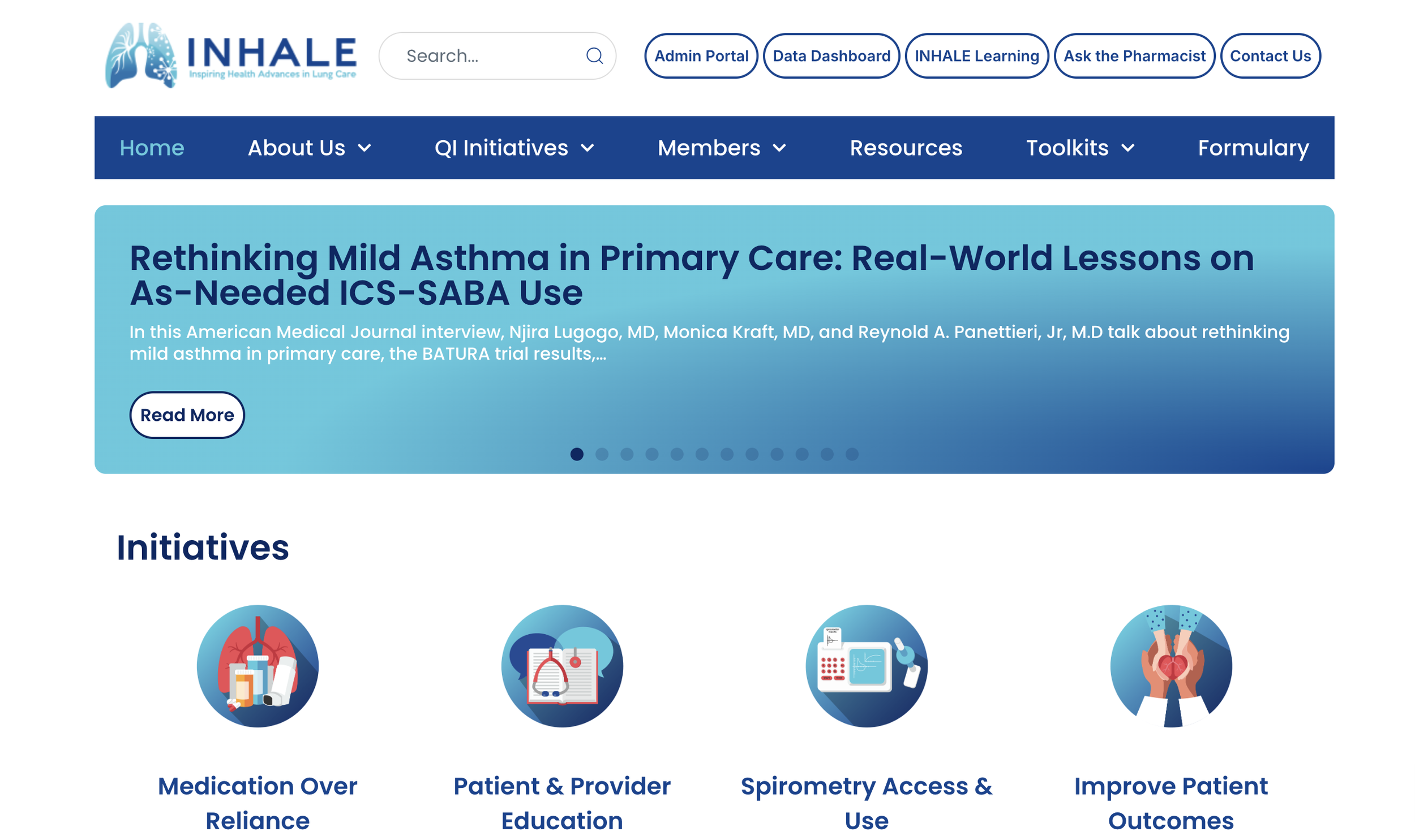
Home Page
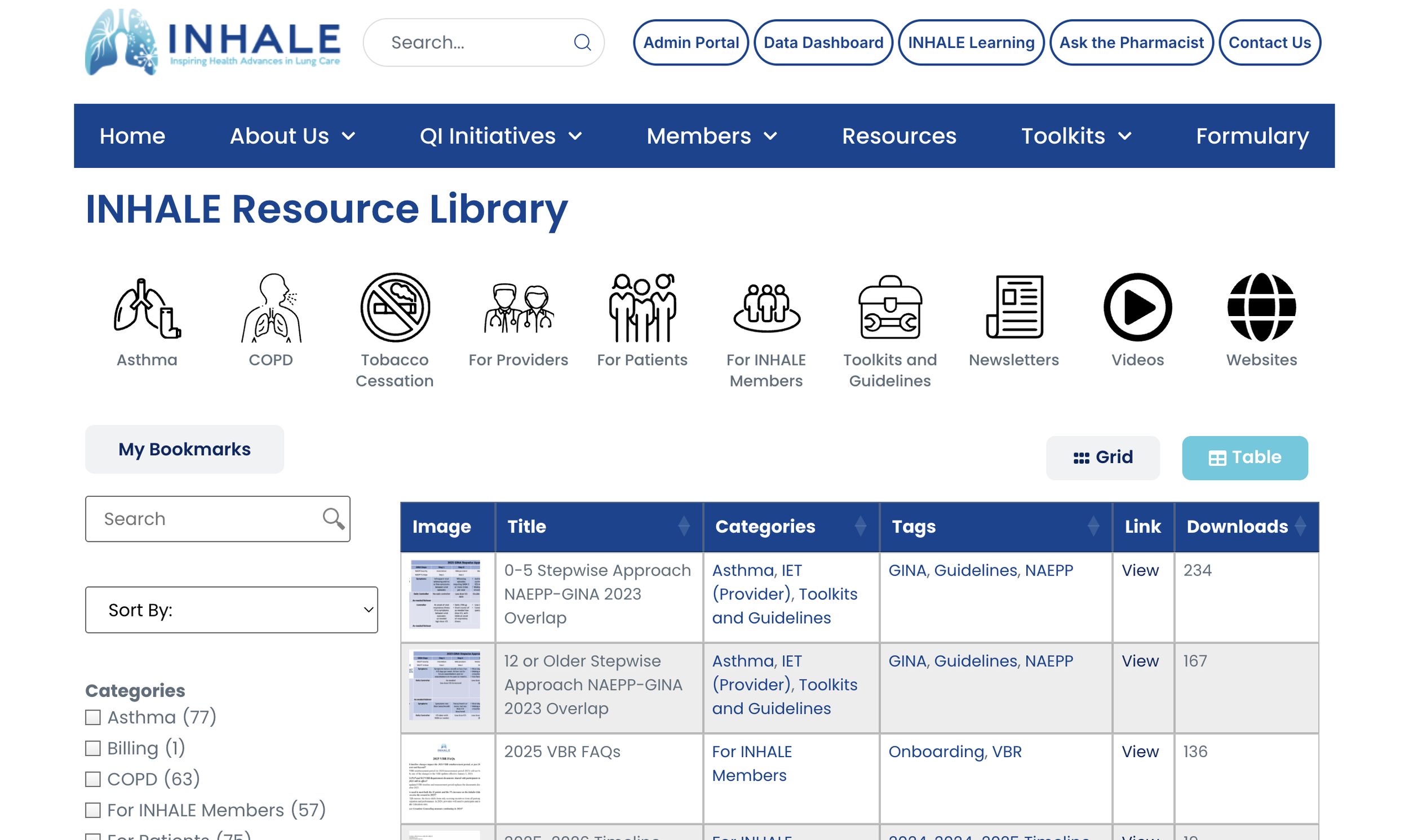
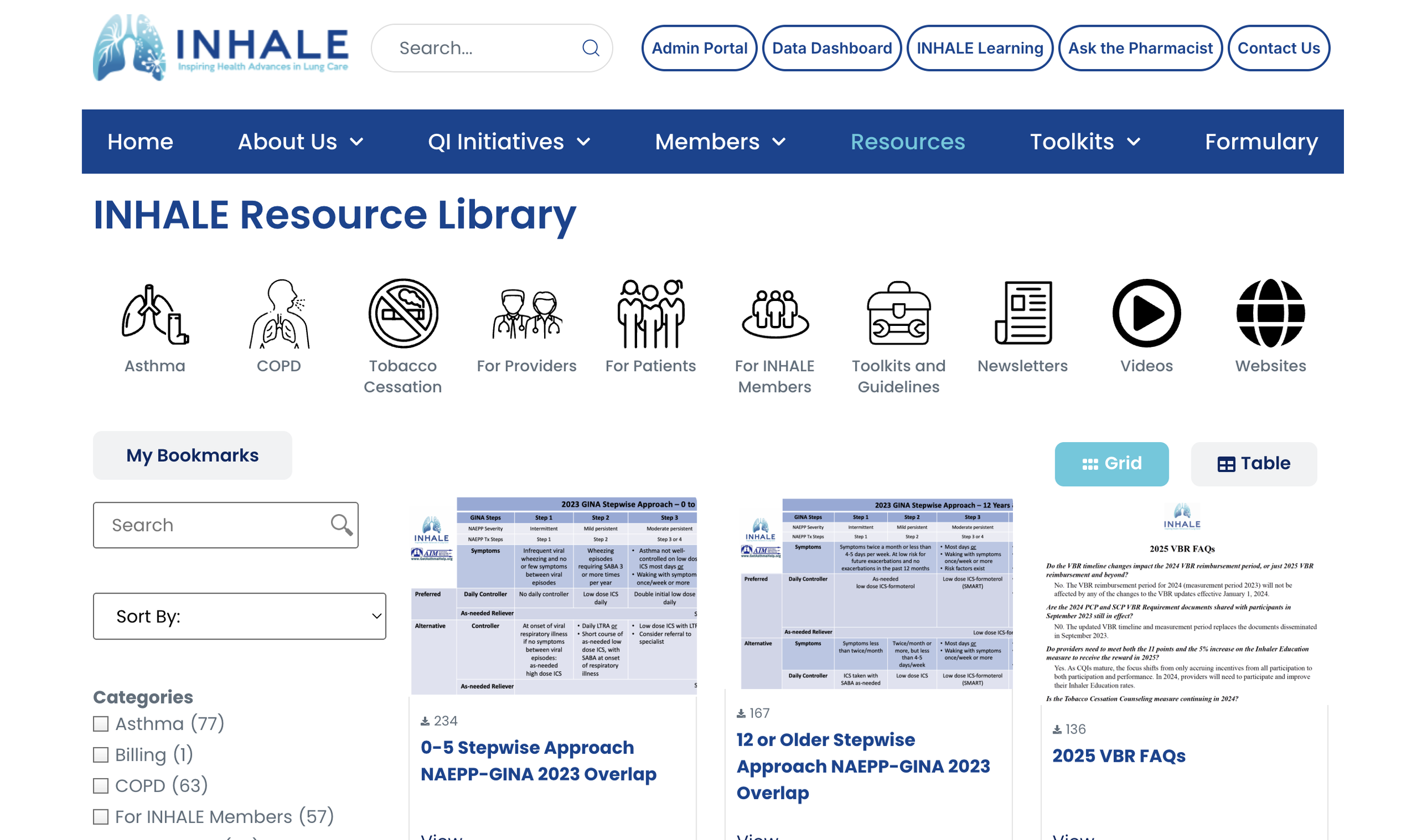
Resource Library Page (List View)
Bookmarks Page

Meetings Page
Resource Library Page (Grid View)

2. Research & Discovery
We used a mixed-method approach to understand the current website experience from multiple perspectives. This phase helped us identify what was working, what was confusing, and what needed improvement.
2.1 Research Methods
User Interviews: 12 participants (patients, caregivers, providers, and users who have never used the site before) shared their experience and opinions about the NHALE website.
Card Sorting: 8 Participants grouped and renamed menu items in a way that made more sense to them
Usability Testing: 12 participants were observed as they tried to complete tasks on the site. 8 of these participants were recalled to test our solutions.
Competitive Analysis: Reviewed 5 websites similar to INHALE
2.2 Key Findings
Unclear Purpose: “What is INHALE?” was a common first question. Users didn’t understand the organization or audience.
Navigation Confusion: Terms like “QI Initiatives,” “Formulary,” and “OCS” were difficult to understand. Users didn’t know where to start.
Homepage Disconnect: Users felt overwhelmed or discouraged by content. One said, “Seeing asthma deaths on the homepage isn’t welcoming.”
Overloaded Resource Library: Too many filter options, duplicate or similar titles, and no clear way to see which resources matched which audience.
Bookmarking Issues: The feature was difficult to find and not intuitive.
Content Readability: Long paragraphs and unclear language frustrated users. A participant said, “I just want bullet points or quick info.”
Need for Grouped Content: Users wanted separation between provider tools and patient education.
2.3 Supporting Quotes
“The navigation is terrible, and the focus is on clinicians, not patients.” – Patient Advisor
“If I were a patient, I wouldn’t want to read paragraphs. I’d want to skim it.” – Provider
“Seeing asthma deaths on the homepage isn’t welcoming.” – INHALE user
“Adding a ‘Save’ button or a favorites section would help.” – Non-affiliated user
“I wish what I was looking for I could get to quicker.” – Provider
2.4 Observations
Medical acronyms and jargon were a consistent barrier.
There was strong interest in clearer groupings for patient vs. provider resources.
Visual learning tools like icons, videos, and labels were well received.
2.5 Insights from Other Websites
MCT2D: Good content organization, creative navigation, and great visuals.
GOLD: Good strategies for engagement, organization, and accessibility.
ALA: Targets content by user roles and includes a comprehensive lung disease search feature.
AsthmaMD: has a simple yet effective symptom-tracking that aligns with INHALE’s user engagement in asthma management.
ASPIRE: Emphasizes a clear resource navigation and a simplified homepage design.
3. Design Requirements & Strategy
The design requirements were shaped directly by patterns and frustrations surfaced during user interviews, card sorting, and usability testing. We prioritized solutions using the MoSCoW method—Must-Have, Should-Have, and Could-Have—to structure our work based on what would have the highest impact on usability.
Goal
To reduce confusion, promote clarity, and make it easier for different user groups—patients, caregivers, and providers—to accomplish key tasks. Each requirement was tied to direct user needs or usability challenges observed in research.
3.1 Must-Have Requirements
Clear Navigation Labels: Replace or remove jargon-heavy terms like “QI Initiatives,” “Formulary,” and “OCS.” Labels were tested and refined based on user-suggested groupings from card sorting.
Homepage Banner with Mission Statement: Many users didn’t understand what INHALE was. A clear mission statement and visual branding were prioritized on the landing view.
Improved Filtering and Search: The existing Resource Library lacked intuitive filters. We required filters that clearly show which tags are active and how many resources match.
Simplified Information Architecture: We consolidated or reorganized top-level navigation to reduce cognitive load and ensure fewer clicks to content.
3.2 Should-Have Requirements
Content Separation by Audience: Create clear visual and navigational pathways for providers vs. patients, avoiding confusion about who resources are for.
Bookmarks Page with Filtering and Sorting: Previously, bookmarking functionality was hidden. The redesign required a visible save feature, clearer icon use (bookmark instead of star), and filtering/sorting options on the saved items page.
Filter Feedback: Highlight selected tags or filters at the top of the page with visual indicators that can be removed in one click.
Content Previews: Provide short summaries or preview descriptions on Resource Library cards so users can decide at a glance whether to click.
3.3 Could-Have Requirements
Impact or Testimonials: Integrate INHALE success stories or impact statistics to build community trust.
Each requirement was carefully validated through usability tests, with multiple iterations made based on direct user reactions and feedback. These strategies helped ensure our final design is user-centered, inclusive, and actionable for INHALE’s implementation.
4. Design Process & Iterations
Our design process was highly iterative and driven by user insights at each phase. We followed a structured workflow beginning with low-fidelity sketches and wireframes, which we evolved into mid and high-fidelity prototypes. Feedback from each round of user testing directly informed layout choices, terminology, visual hierarchy, and interactivity.
4.1 Early Sketching & Ideation
We began with rough sketches to explore structure, layout, and potential changes to content prioritization. We experimented with:
Different homepage hero formats (image banners, mission headers, rotating carousels)
How to organize filters in the Resource Library
Concepts for split pathways (patient vs. provider)
These sketches were shared with peers and mentors for informal critique, which helped refine our approach before digital design began.
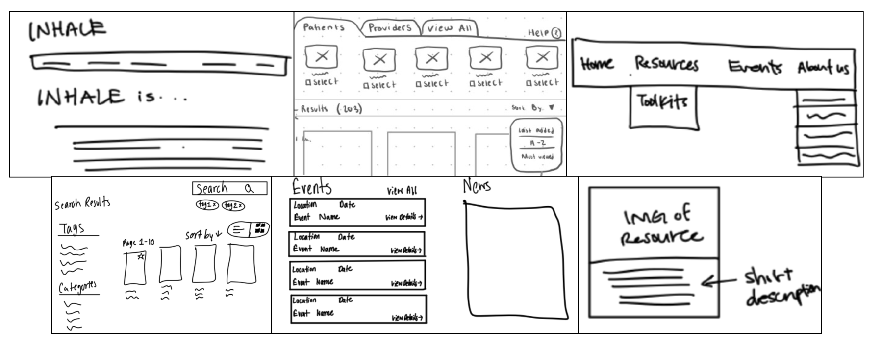
4.2 Wireframing & Low-Fidelity Testing
We built black and white wireframes in Figma to test user flows and page structure. Our goals were to:
Validate new navigation structure based on card sorting insights
Clarify homepage messaging and calls to action
Reduce friction in resource browsing and saving
Users completed early tasks with these wireframes in guided walkthroughs. Key feedback included:
"This already feels better. I know where to start now."
Confusion around where QI Initiatives should live (Members vs. About)

Testing
We evaluated the redesigned INHALE prototype through structured usability testing with eight participants. Our goal was to understand how the updated interface affected task success, confidence, and clarity across both INHALE-affiliated and new users.
5.1 Testing Setup & Process
Participants: 3 non-affiliated users (students), 5 affiliated (providers, advisors, caregivers)
Method: Remote testing via Zoom with screen sharing and think-aloud protocol
Duration: 30–40 minutes per session
Tasks: Participants completed the same core tasks from the research phase, such as locating a resource, filtering results, saving a resource, and navigating to specific pages like QI Initiatives
Tools: Observation notes, success rate logging, timing, and ease-of-use rating scales (1 = easy, 5 = hard)
5.2 Evaluation Metrics
Success Rate: Whether the user was able to complete the task correctly
Ease-of-Use Rating: Participant self-reported difficulty after each task
Time-on-Task: How long it took to complete each action
Qualitative Feedback: Recorded quotes and behavior patterns
5.3 Key Performance Results

5.4 Observed Behavior
Users liked the visual tags when scanning through resource cards.
All participants used the top-level navigation bar in the resource page successfully without guidance.
A few users who are used to current the INHALE website, struggled with muscle memory as things shifted around but stated that the redesign would be easy to get used to.
Users like the simplicity and grouping of the new website navigation.
Some confusion remained around where to locate help/contact options.
Users liked the audience direction in the homepage
Outcome
Desktop Wireframes - Final Stage
Note: Click on Images For Page Interaction
Home Page

Resource Library Page (List View)

Resource Library Page (Grid View)

My Bookmarks Page

Participation Activities Page (List View)

Participation Activities Page (Grid View)

Participation Activities Page (Calendar View)

Results
Participant Quotes
“This is way more clear than before. I didn’t need to think.”
“The filter tags are awesome—I know what I’m seeing.”
“I wouldn’t have known that’s where I go to ask for help about medication.”
“This version feels like it’s made for someone like me, not just doctors.”
Insights & Takeaways
Most major barriers were resolved: Participants could find and use the resource library more easily
Navigation and filtering were intuitive: Especially with visual tags and audience grouping
Users mentioned the use of icons aren’t consistent throughout in terms of what we created and what inhale had.
Users that use the current website a lot may face an initial struggle to get used to the redesign
Overall, the redesign showed clear improvements in both efficiency and confidence. Users needed fewer prompts, made fewer errors, and completed tasks faster. The few remaining points of confusion offer a focused path for future refinement in our recommendations.